Fix What Bugs You (aka Lean) - Tool post wrench

Awhile back I was listening to Episode 101 of The Productivity Show in which Paul Akers of FastCap was being interviewed about lean. Lean is one of those buzz words that gets thrown around without much thought, but he explained it in a simple way that the marketers would never approve of and some would argue is just common sense. Paul said lean means that you should "fix what bugs you". While many of us do that already, I've tried to keep that mantra going as I've been working on projects or just going through daily life. That coffee container that I hated dealing with every morning because it was slow? Gone and replaced with a fast open/close sealed container. That one annoying error message on my laptop I've been closing out every time I boot up for the last year? 15 minutes with google and I'll never click it again. These are all little examples of realizing that something was, and had been, annoying me and stopping what I was doing to fix it. Paul talks about this idea some in a video (below), but I wanted to share an example of a recent thing that bugged me and I fixed with about an hour's worth of effort.

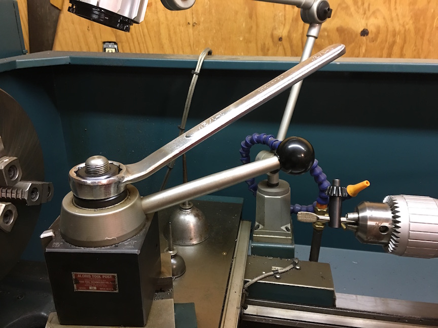
When I'm using tools, I want to be efficient. I want to have the right tool for the right job and do the job well. Recently I was using a lathe to make some parts and noticed that they had been using a large crescent wrench to adjust the tool post  on the machine. The wrench was about 2 feet long and was heavy. Not only that, it encouraged over tightening of the nut with its excess mechanical advantage. Every time I changed the tool post, I pulled out the big wrench and carefully adjusted things. This got old very quickly.

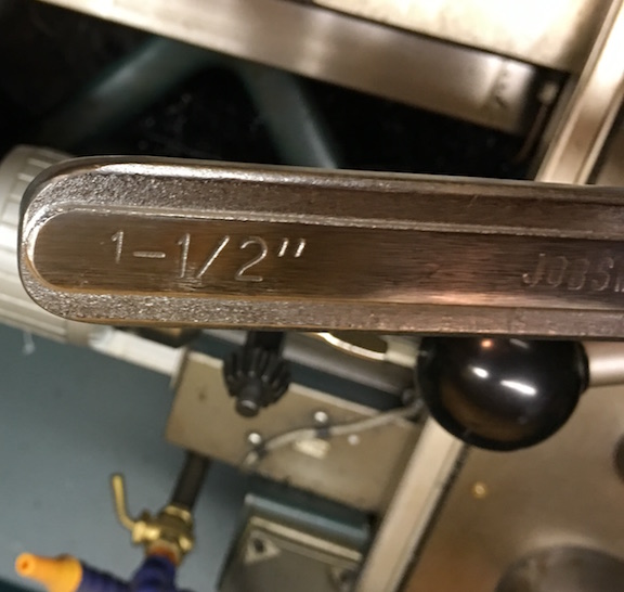
I stopped into Tractor Supply Company and bought a 1.5" combination wrench for $15. I took the wrench back to the shop and put it on the adjustment nut. It was still a bit long and interfered with the lever on the tool post lock, so I still wasn't very happy. For $15, I decided it was time to fix this problem once and for all.

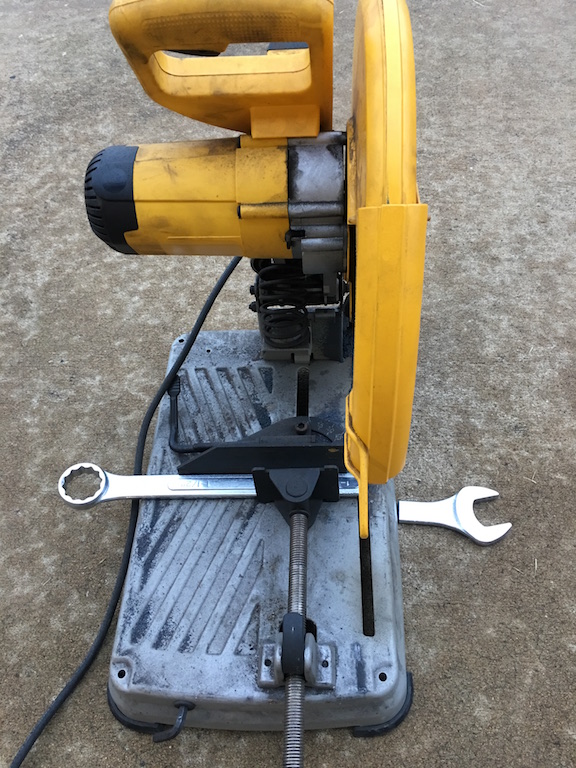
First I got out the chop saw and sawed off the open end that I didn't need. This took just a few seconds and already had the handle at a more suitable length.

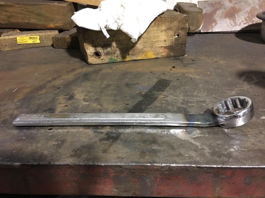
Next, I grabbed the torch and heated the tool until I could bend the wrench so that the handle was at an angle. It took a few trips across the shop, trying the wrench on the machine, to get the angle just right.

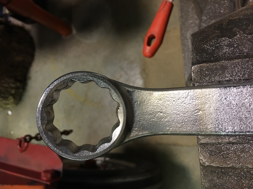
I could have stopped, but I wanted to have a nice rounded handle end that was smooth to slide your hand off and wouldn't scratch the back of your hand if you brushed against it. After some grinding, filing, and emery paper work I had a really nice smoothed surface. A bit of time on the wire wheel cleaned up discoloration where I had heated the tool.

And with less than an hour's worth of time, I had a nice little tool to set the tool post. Now I'm less resistant to readjusting and therefore can make better parts faster. Lazy? Maybe, but it sure is nice to not dislike the tool and I've made it harder to make a goof like over tightening.

Is this rocket science? No. In fact, Keith Fenner has done this as well (video below). The point is, look around and find a few things this week that bug you and take 5-60 minutes and fix them. The time and frustration saved will be worth it!

Adding FPV to your Drone

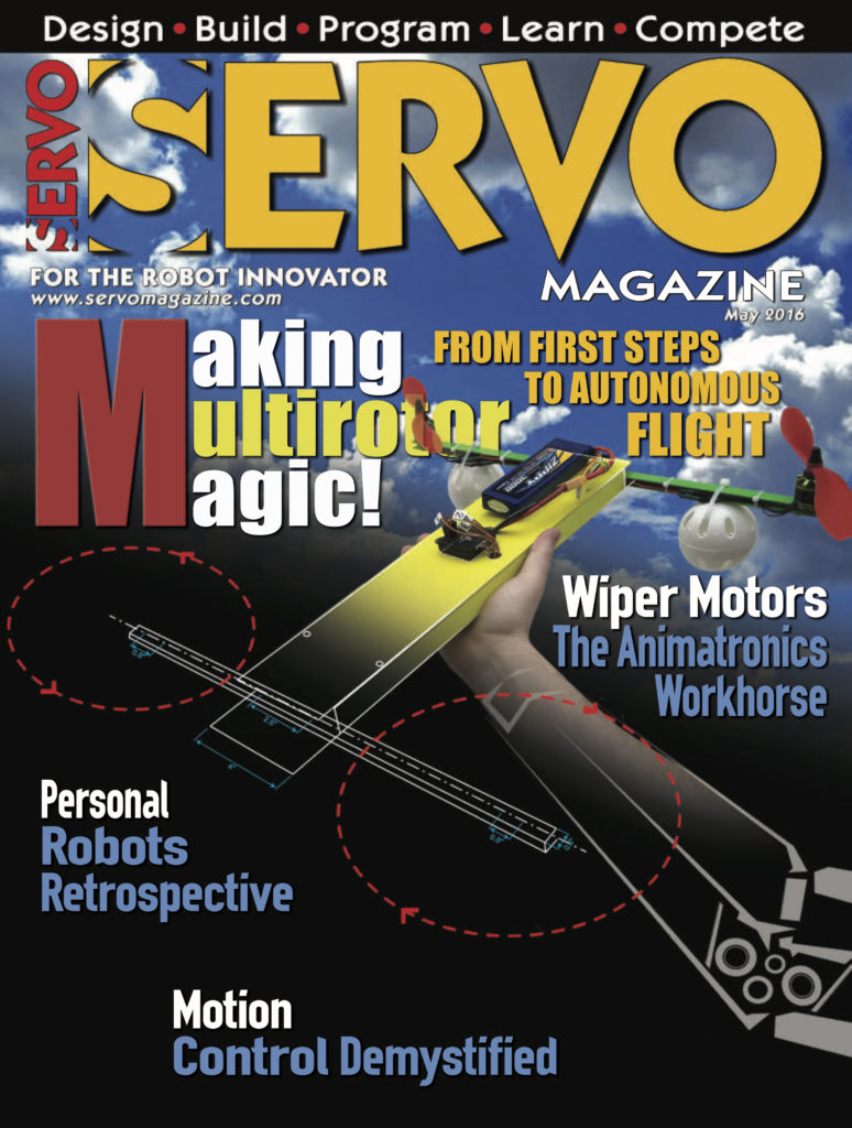
Awhile back I shared that I had begun writing a column for Servo Magazine, beginning with building a drone from scratch. If you want to get a taste of the column, you can read the article "The Multi-Rotor Hobbyist - FlyFi: Weather Data Telemetry" for free!

This month I was lucky enough to have a cover feature on adding a camera and googles/screen to your drone setup. Adding this "First Person View" (FPV) capability really makes flying a lot different as its like you are setting in the cockpit!

Several years ago, I rode in the copilot’s seat of a small Cessna circling over northwest Arkansas. The view was great and the experience of sitting right behind the propeller with a view of where we were headed was fantastic. It made riding in economy of commercial airliners seem even more boring and cramped than it already did. As multirotor pilots, we can now have that experience with first person view (FPV) equipment that literally puts us in the pilot’s seat and immerses us in the experience of flying.

Be sure to checkout the column and let me know of other topics you'd be interested in seeing in future articles! Right now I've got a photogrammetry series coming up after a quick CX-10 hack.

Podcasts I'm Listening To

Image: http://www.urbandharma.org/images/podcasts011.jpg

I've had a few requests to list the podcasts that I'm listening to. In addition, Elecia and company over at Embedded.fm compiled a list recently as well, so I'm hopping on the bandwagon. If you haven't tried listening to the Don't Panic Geocast that I co-host, I would highly recommend it, but I'm biased! These shows are listed alphabetically and span a variety of topics. I will come back and periodically update this list as I discover new shows and mark discontinued shows as such. Please feel free to recommend any you think I have missed!

KiCad and TextExpander - How I saved a few hours of BOM making

2016-07-30 21.03.20Folks that follow my various projects have probably noticed that I've recently formed an instrumentation and consulting company. I've had great fun doing several jobs for folks ranging from CAD design of brackets to writing numerical models for projects to designing custom measurement solutions. I've also been very busy designing some exciting new hardware that I hope will be available soon. In this post I wanted to share a time saving trick I used in KiCad while designing my printed circuit boards for one of these projects.

When designing things to be made in any quantity by an assembler or manufacturer (and for financial reasons) you need to keep a really good bill of materials or "BOM". Doing this often involves linked Excel sheets, binders of parts lists, and general gnashing of teeth. When working on the BOM for my circuit boards I found an excellent post by Dan over at Rheingold Heavy on designing for manufacture with KiCad. In this post he outlines a really nice workflow on how to keep track of part numbers and other meta-data  for each component. Ideally this would happen at the beginning of a project. You would assign a part (say a resistor) a manufacturer's part number, distributor's part number, etc. Then, you can copy that component (and it's metadata) as many times as you need by simply hovering over it and hitting "C". Well, I already had my entire schematic and board layout completed. I had a lot of components that were used many times (think 10 k resistors, 0.1uF caps, and jumpers). I didn't want to keep copying and pasting the information over and over from the websites of the manufactures and distributors and I didn't want to delete the components and copy in components with metadata for fear of destroying my completed project, footprint associations, and who knows what else. My solution? TextExpander.

TextExpander is a program that stores snippets of text and lets you type a few trigger keys to place all of that text in a fraction of a second. I've used it for years and it has easily saved me tens of hours on my laptop. I've got snippets for date and time stamps, outlines for our podcast, form replies about common technical issues in our lab, chunks of code that I use a lot, and really just about anything else you can imagine. (I forgot to add LaTeX equations/tables in there, but that alone saves me a lot of time on every paper I write.) The pricing model for TextExpander has changed recently, and I'm not a huge fan of the new scheme, but that's beside the point.

My idea was simple. I made a set of snippets that would expand into web addresses and part numbers. I would copy information in for a certain part, then using TextExpander add that information to add parts of that kind. After that, I'd change the snippets to the next part and repeat. Yes, this took awhile, but nowhere near as long as if I'd done all of the population by "hand". I've made a quick demo video below to show you how it's done. I hope this ends up being useful to others, let me know of any tricks you've come across to speed your DFM process.

Cheerson CX-10 Motor Repair

2016-06-07 19.53.32

If you've been following my drone work through Servo or on social media, you have probably seen me posting pictures of the tiny Cheerson CX-10 quad. You can pick them up for ~$15 on Amazon and have hours of fun. As you can imagine, there is a fair share of crashing at first while getting used to the response of such a small vehicle. After a few run-ins with the wall, I could fly it pretty well though. I picked up a couple more, including a model with a camera. Amazing for the price. A couple of weeks ago there was some random falling out of the sky behavior, followed by the realization that one of the props on two of the three quads was not turning anymore. I checked for any hair/carpet wrapped on the shafts, but they were clean.

I needed to repair the quads as I'm working on a little project modifying their controller for a future Servo article (preview photo below). Sure, they are cheap enough that they are almost disposable, but I figure if nothing else I could swap some parts to get at least one working vehicle out of the two. Time to crack it open!

A teaser of a future project that I'll be writing up in Servo.

A teaser of a future project that I'll be writing up in Servo.

There are four small screws holding the plastic half-shells together. After removing those and placing them in a container for safe-keeping I gently pried open the plastic clips at the end of each motor extension arm. This was easy to do with just my fingernails. The two parts of the case came off and I was staring at the printed circuit board. (Side note: the camera is some module they just tacked on, so I just pushed it out of the way and ignored it.)

Four screws hold the airframe together. A jeweler's screwdriver set was essential!

Four screws hold the airframe together. A jeweler's screwdriver set was essential!

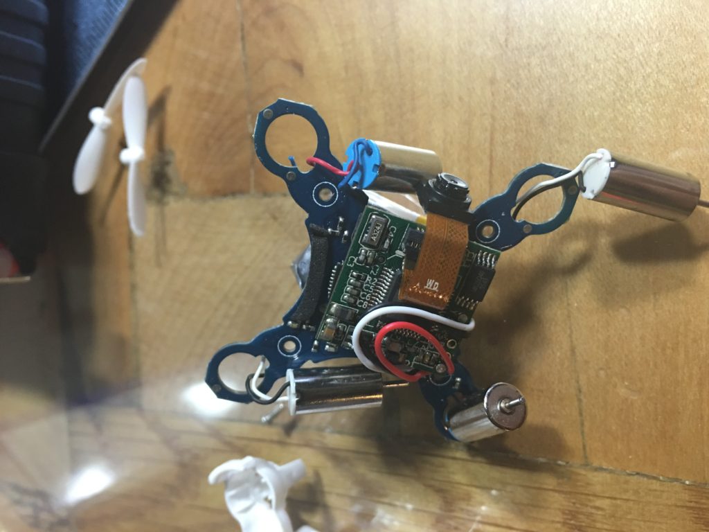
The problem was immediately obvious - the ground wire to the nonfunctional motor had been severed. Looking at a few other wires, it looks like they commonly get pinched in the enclosure during assembly. After repeated run-ins with objects, the wire was eventually sheared.

Note the broken blue wire in the upper right of the photo. Luckily this was an easy fix.

Note the broken blue wire in the upper left of the photo. Luckily this was an easy fix.

Using a little bit of magnet wire and a magnifier I was able to splice in a new section of wire. I was startled when the motor somehow jumped to life as the free end of the magnet wire swept across the PCB during the repair. I insulated it with a bit of electrical tape. The tape prevented me from inserting one of the four screws upon reassembly, but so far that doesn't seem to be a problem. Putting things back together took just a few minutes and I was happily flying again!

2016-04-16 19.42.51 copy

The moral of this story is that if you have one of these little quads and it seems to have died, go ahead and open it up! If the problem comes back, I may buy some extra motors or start a parts pool from other quads. Looking at the construction of the quad was a bit scary though - I think they will live in my LiPo fire safe now.

If you want to know more about how these little quads work, checkout these blog posts by Elecia White in her toy teardown series. Also, if you haven't listened to the podcast Elecia and Chris host "Embedded.fm" and you're reading this, you would probably enjoy it!
See you in a couple of weeks with a revisit of a popular myth we tested about a year ago!

Build a Drone!

cover_servo_May2016

Things have been a bit slow here at the blog with a lot of things happening at work and the fact that I'm not also very excited to be writing a monthly column about multi-rotors in Servo Magazine! Not to worry though, I've still got some excellent projects queued up for the blog, including one that has currently filled my living room with sawdust.

In this post, I wanted to share with you a video of the drone I scratch built flying around and encourage you to follow along and build it as well! The entire project cost about $350 and produced a really nice and versatile platform that I'm going to be adding instruments to, as well as GPS, telemetry, etc. The May issue of Servo featured the monthly column introduction on the cover! That column talks about FAA rules and how to get registered. The following columns are going to go through building the drone, step by step. We'll start off with the airframe, then move on to adding electronics, setting up the flight controller, and finally flying under manual and computer control. We already have other articles planned that include reviewing commercially available quads, as well as hardware hacking them for new functionality.  If you like the blog, you might like to follow that series of articles as well!

Think Different - Upgrading a "Sad" iMac

phil-schiller-625x350

During the spring announcements, Apple executive Phil Schiller said that about 600 million people are using computers over five years old and said "This is really sad." The comment made a lot of folks angry, especially those in despair over the ever rising cost of Apple hardware with seemingly less functionality. Along with several of my co-workers (all Apple fans, including myself) there has been chatter of what the company's future holds. Today I'd like to tell the brief story of my Apple computing adventures and recent hardware upgrades I made to a 2007 iMac that have it running like a champ.

I was formerly a PC person, but during my undergraduate I was converted to Mac by the ease of developing code and doing scientific research in a *nix based environment. Macs were less prone to viruses, superior hardware that was designed to be compatible with superior software. I had no problem paying good money for this hardware, it lasted and lasted. I dove in with a white MacBook and 27" iMac in 2007. The MacBook had some cracking issues with the plastic that Apple was swift to repair for free. The iMac was flawless. I could upgrade the RAM easily. The hard drive wasn't so easy, but that's for later.

In 2011 I decided to buy a MacBook Pro laptop as my primary machine along with the beautiful 27" thunderbolt display. This was a very expensive trip to the mall! I still use the monitor daily and love it. The MacBook Pro did the majority of my computing, until late 2013 - wait what? Yes, due to a design flaw, the excessive heat from intense computation had cracked solder joints on the logic board. Others I know were plagued by this as well. It was an ~$800 repair to get back to working, but it could be expected to fail again. I set aside a several thousand dollar machine after not quite 3 years of service. I had just put a hybrid SSD in and more RAM to add insult to injury. Apple did nothing.

By this point in time I had a nice 2012 iMac at work that all of my "serious" computation happened on, so I bought a MacBook Air for my laptop/home machine. It's light and the battery life is unbeatable. I really like it, but in just a few years it has aged poorly. I'd like to get more RAM inside and a larger SSD. That's not possible since in an effort to make it thin, these components have been soldered to the logic board. There are no upgrades possible. Again... what? I can't take advantage of the rapid reduction in storage prices? Ugh.

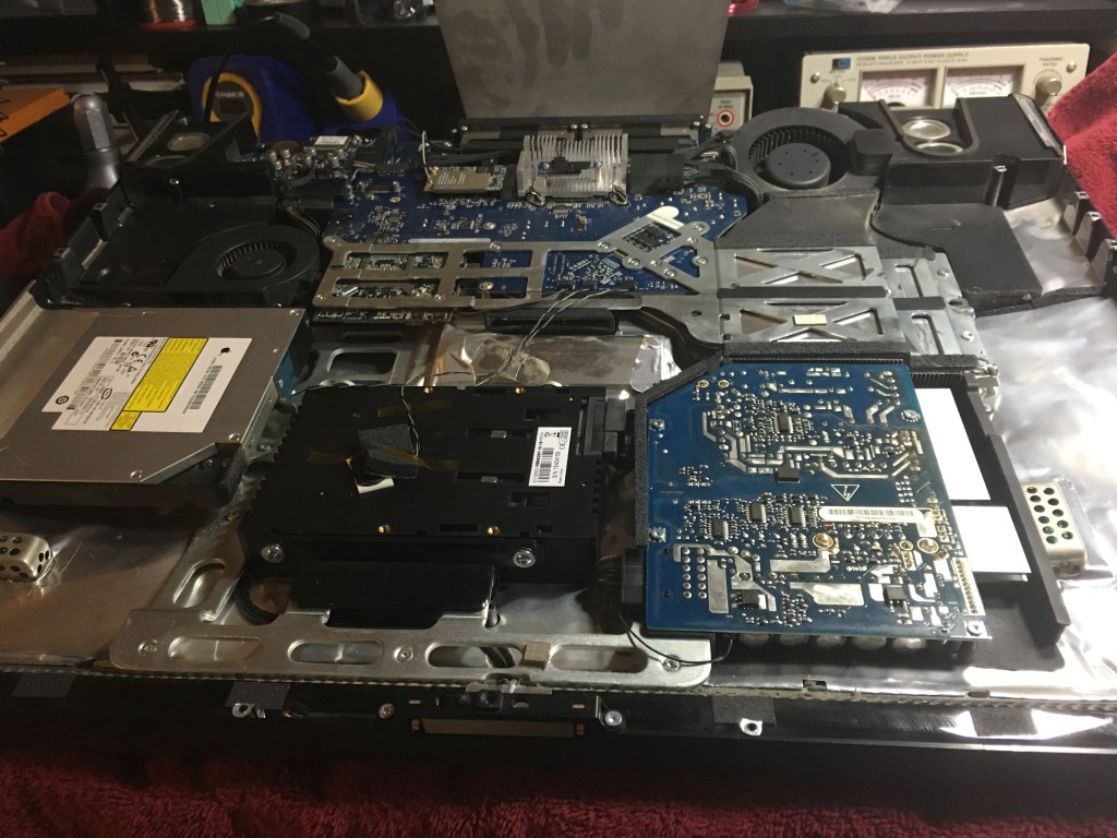
Now to the point of the story. My wife has been using my 2007 iMac, the first one. It was getting slow and unfriendly to use, so I decided to max out the RAM (4Gb) and put in an SSD. For a couple hundred dollars in parts and an evening's worth of work, the computer runs like a champ. It's certainly not like a new machine, but it will last for several more years and after that would be a great machine for my 3D printer to use full time. It still runs Adobe Illustrator and other graphics programs. It's a perfectly usable machine. That's all because I can upgrade it. Sure, instilling the new hard drive was a PAIN. I had to pull the monitor out and ended up doing it twice because of a contact issue. But it worked and we got more life out of it!

2016-03-12 18.41.37

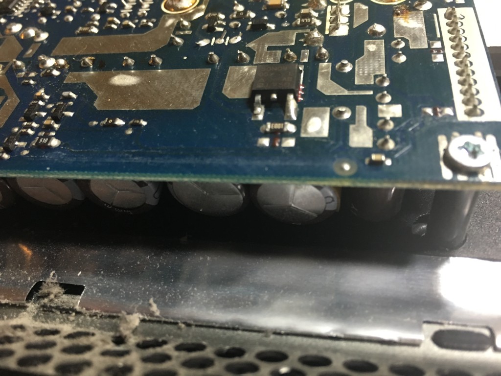
While in there, I noticed that one of the power supply filter capacitors was bulging and likely bad. Not a problem! This power supply and system was over-engineered. Sure the computer was a bit thicker than my new iMac, but hey - I didn't have to replace the power supply! Weight and size really count when sending things to space, but I'm pretty sure most Apple hardware stays firmly on the ground.

2016-03-12 18.41.32

What's the point of me telling you about my history of Apple purchases? Am I not biased since I am a MacBook Air, iMac, iPhone, iPad, Apple Watch owner? It's to say that I'm worried. I've always treasured Apple products because they just worked, they let me do my job with the least amount of friction. Recently I've spend more time fighting limitations of machines that I can't upgrade, battling bugs in software released to the public that Steve Jobs would have called "beta" at best. Am I ready to jump ship? No. Am I looking around? Yes.

As many of you know, I'm involved in a lot of engineering projects as well as pure geophysical research. A lot of engineering software like SolidWorks is designed to run on Windows. Some programming and hardware CAD/CAM tools I use are Windows only as well. I've generally run a virtual machine on my computers with Parallels. (Which is now a subscription model.) It is quickly becoming the case that I'll spend time in both operating systems everyday. I even bought a Microsoft Surface because the note-taking with a pen experience is so much better than Apple's offerings.

Many CAD tools are also beginning to offer Ubuntu Linux versions as well. I've even found these to be better maintained that the Mac native versions of such applications.

I used to say that I was going to build a desktop with amazing specs and run Ubuntu on it. I'd sure miss some of my Mac Apps though, things like TextExpander, OmniFocus, and OmniOutliner to name a few. I do have them on iOS as well. I'm very curious to see what happens in the next five years as things become increasing platform independent and cloud based. Will the switch between devices become seamless? Microsoft's surprise announcement about the integration of the bash shell into Windows 10 yesterday certainly showed that they are willing to cater to developers that Apple is beginning to limit. The multi-platform OneNote product is also exceeding anything Apple Notes can do.

Right now, I can't say where we'll all be in a few years. The fact that Apple used their most recent event to announce another size of screen and watch bands instead of new Mac hardware has me worried. Power users seem to be a non-priority for Apple since the over-priced and non-upgradable Mac Pro (trashcan version) was released in 2012. I need reliable, strong computers and I'm getting tired of carrying 2 laptops, a tablet, a phone, an iPad, etc. I'm hoping the situation becomes more clear in a few years when it will be time to retire a lot of my current hardware.

A final sidenote - I recent received an 8Tb hard drive for review. In the days of the tower Mac Pro I could have popped it into one of the many equipment bays, maybe added a new video card while I was there. Now I need to buy an external dock and takeup a USB-C port. Maybe I should look into NAS systems... Maybe I should build a tower at my workbench. How have you been thinking about your computing environment recently? I'm wondering if it's time to think different.

How Thick is the Crust?

Earth's Structure (Wikipedia)

Earth's Structure (Wikipedia)

I think the first time I really heard much about the Earth's crust was on the TV show "Bill Nye the Science Guy." (In fact, I was obsessive about not missing an episode as a child and I was ecstatic when I got to see Bill speak at Penn State last year.) He talked about earthquakes and Earth's structure, cut in with funny segments of a family telling their son, "Ritchie, eat your crust."

The crust in an interesting thing - it's what we live on top of and there are lots of interesting places where it's different due to geologic processes that concentrate certain types of materials. The crust is broken up into around a dozen major tectonic plates that move at about 4-6"/year. These plates are either oceanic or continental crust. Oceanic crust is generally relatively thin ~6 km (4 miles) and oceanic crust is much thicker at ~35 km (22 miles). The thin oceanic crust is also more mafic and dense than the felsic continental crust.

These differences create complex interactions when the plates meet each other at plate boundaries. We did a whole show on plate tectonics over at the Don't Panic Geocast recently, so if you'd like to hear about the discovery and arguments over plate tectonics you should check it out.

Today, I'd like to share a tool and Dr. Charles Ammon and I have made to visualize a crust model and allow anyone to explore the crust. All you need is Google Earth! We used a model called Crust 1.0 by Laske et al. that has how thick the crust (broken up into a few divisions) is for  64,800 points on the Earth along with some other crustal properties. That's every one degree of latitude and longitude! They put a lot of work into making this model. Generally we would use a Fortran program to get values out of the model, but Dr. Ammon had an idea to visualize the data in a more intuitive way with Google Earth. Over the Thanksgiving holiday I wrote a Python utility to access the model values and then we wrote a simple script that generates a Google Earth KML file based on the model.

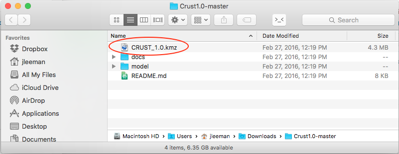
All you have to do is head over to the project's GitHub page and click the "Download ZIP" button. While you're waiting on the download you can scroll down and read all about the development, the model, and find activities to try. Next, open folder you downloaded (most operating systems will automatically unzip it for you now) there will be several files, but the only one you need is the CRUST_1.0.kmz file.

Screenshot 2016-03-12 07.29.51

As long as you have Google Earth installed, double click that file and you'll see the Earth appear covered in red dots. If you zoom out too far, they will disappear though!

Screenshot 2016-03-12 07.31.49

Each red dot is a location where the model has the average crustal properties like how fast P and S seismic waves can travel and the density. All of these are explained in more detail on the project webpage. You should also try some of the projects we have listed there! As a starter, let's look at oceanic and continental crust and verify my assertion about their 3x thickness difference.

Clicking out in the Atlantic Ocean (make sure you are not on the continental shelf) we see about 13 km thick crust (the top of the mantle number). The water depth is also handy to have on-hand sometimes.

Screenshot 2016-03-12 07.35.15

Clicking well onto the North American plate we see about 36 km thick crust. Next you should head over to mountainous regions and basins and see how the structure of the crust is different - why is that? Sorry, no homework answers here!

Screenshot 2016-03-12 07.35.26

This is a really fun way to learn about the crust and a good reference tool as well! There are flyers in the docs folder that you can print to use as teaching aids or handout to students! We had a lot of fun making this 1-day project and hope that you'll explore it and let us know what you think! A big thanks to the folks that did the massive amount of work making the model - we just made it visible in Google Earth! Everything is open-source as always.

Build the PiBooth - Nuts and Volts Cover Story

nv

While getting wedding arrangements ready a few months ago, my wife commented that she would like a Photo Booth at the wedding. I immediately did what I always do, write a Python script. She was thinking more of a table with props and disposable camera approach, but I decided to make it into a project that we could use on any occasion and have some fun with the Raspberry Pi.

I searched online thinking that surely somebody had already done this project and posted their code and instructions. I found a few examples of Pi based photo booth projects, but none that had code attached (mostly they said "my code is awful, so I won't share") and none that did exactly what I wanted. I wanted the booth to count down, take multiple photos of the guests, and store/tweet the photos. I also wanted it to be simple to plug in and turn on with no experience required - same for shutdown.

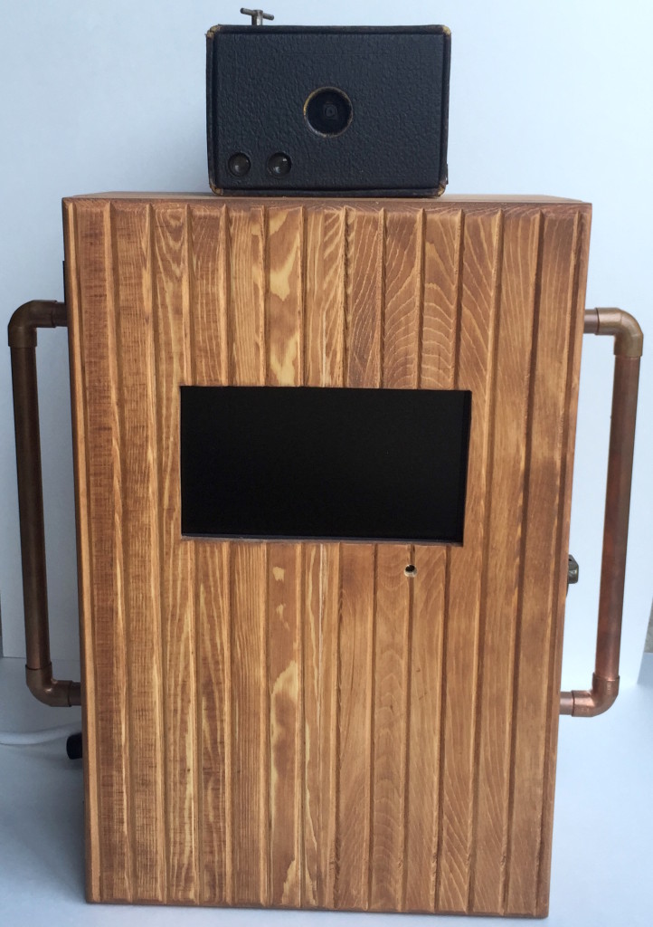
After a few afternoon coding sessions, I had the basic code and guts of the project working. A little time with some wood tools and I had a pretty decent looking enclosure setup as well!

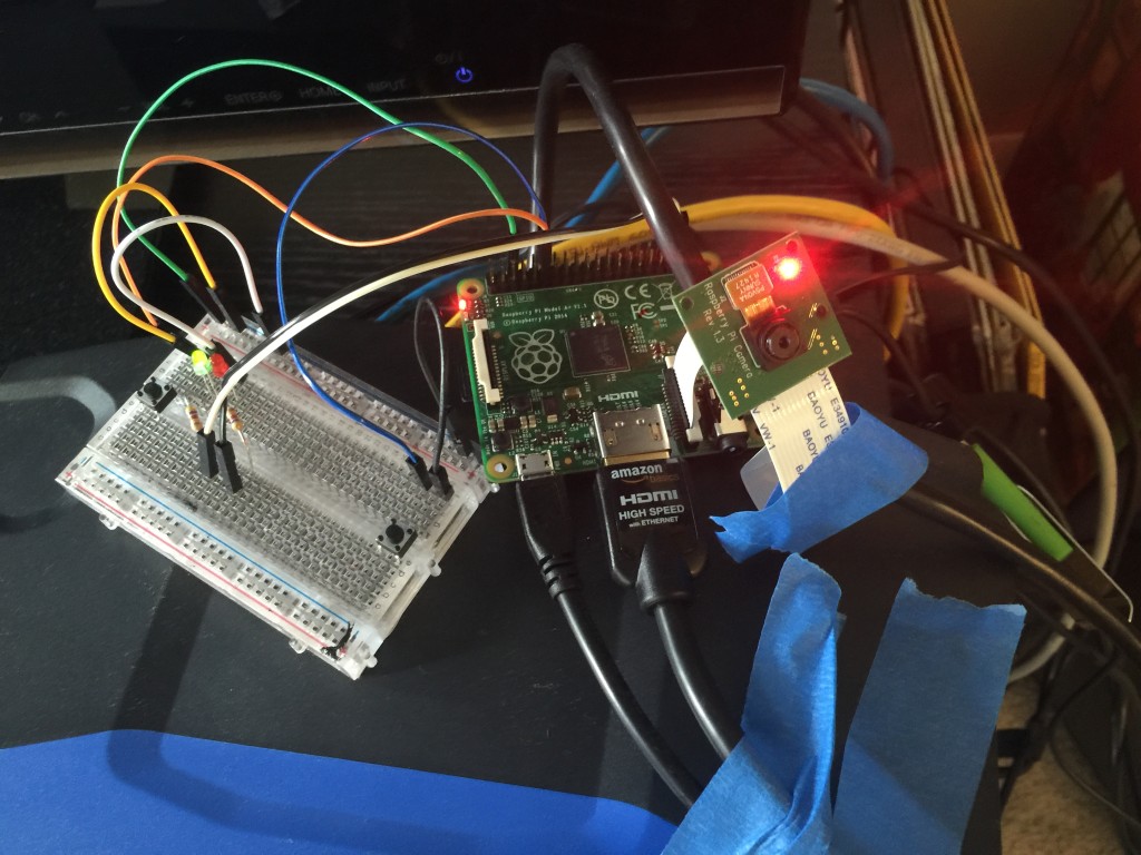
An initial prototype circuit to test the code for the PiBooth.

An initial prototype circuit to test the code for the PiBooth.

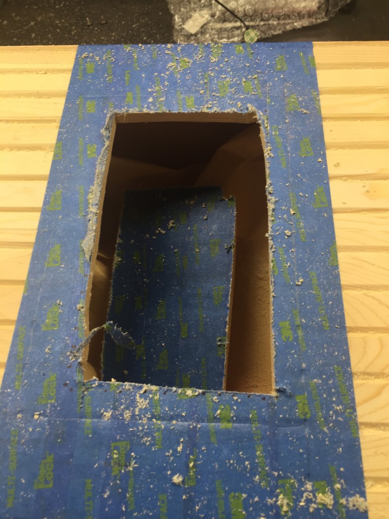
Rough cutting the hole for the photo booth screen in the shop.

Rough cutting the hole for the photo booth screen in the shop.

I wanted to make sure that everything I did was out in the open to be reproduced. I ended up deciding to try writing a magazine article about the build for the electronics hobbyist magazine "Nuts and Volts." The editor sent me some guidelines and after a few hours I had a draft article.  A couple of months passed by while we iterated on figures and ideas, but I was very excited when I was contacted saying that this article was being considered for the cover of the March 2016 issue. As you can see - it was selected! Be sure to grab a copy of Nuts and Volts (check your bookseller/news-stand) and read all of the details. You can grab the code over on the GitHub repository. Thank you to all the wonderful folks at the magazine for making this happen and thank you to my wife for letting me run wild with this project! Let me know if you build one, or a variant. The applications can range from parties/events to making an automated I.D. card station for your company!

Figure 1

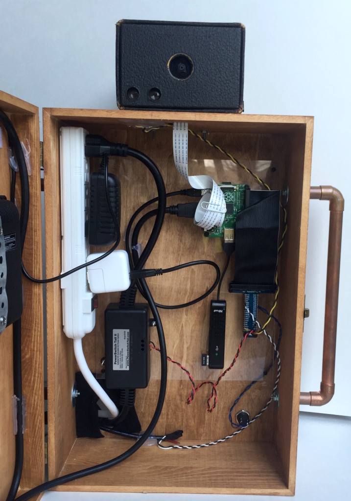
Guts of the project.

Guts of the project.

Tracking Earthquakes Across the Globe - Travel Times

A few days ago I had the Epicentral+ app running on my iPad sitting on my desk and saw an event come on the screen. By looking at what stations were measuring ground movement first, second, third, etc. I could make a good guess at the event's location. Did you know that, with the data from a single seismic station, you can begin to guess the epicenter?

Generally earthquake locations are performed using many stations and algorithms that have been tweaked for years as we want to get ever more accurate locations. The USGS does this location for many events every day. It's fun to keep a live feed of the global seismic data up and look at the patterns. This is possible thanks to applications like "Earth Motion Monitor" and "Epicentral+", both products of Prof. Charles Ammon. They are worth installing and having a look. Prof. Ammon has seen the value in being able to watch signals for long periods of time: you begin to pick out patterns and get an intuitive feel for the response seen due to different events. While I don't have nearly the amount of insight possessed by experienced seismologists, I wanted to show you a quick and simple way to figure out about how far an event was from a given station. If you combine that with some geologic knowledge of where plate boundaries are, you can likely narrow down the region and earthquake type before anything comes out online.

The event I saw is a pretty small event, a magnitude 5.8 near the Fiji islands; it'll work for our purposes and not provide too much distraction. I've marked it with a white star on the map below (a Google Earth map with the USGS plate boundary file). This event occurred near the North New Hebrides trench, part of a slightly complex zone where the Australian plate is being pushed under, or subducted, beneath the Pacific plate.

Our earthquake in question marked with a white star near the North New Hebrides trench.

Our earthquake in question marked with a white star near the North New Hebrides trench.

Though the event was not huge, it was detected by many seismometers around the globe. In fact, there is a handy map of the stations with adequate signal automatically generated by IRIS. The contour lines on the map show distance from the event in degrees (more on that later).

Stations and their distance from the earthquake. (Image: IRIS)

Stations and their distance from the earthquake. (Image: IRIS)

I saved an image of assorted global seismic stations about an hour after the event occurred. You can see energy from the earthquake recorded on all stations, with some really nice large packets of surface waves (the largest waves on the plot).

raw_seismograms

We're actually interested in the first two signals though, the classic P and S waves. Let's take a closer look at the station in Pohakuloa, Hawaii. We can see the first arrival, the P-wave, then a few minutes later the S-wave. The P-wave (a compressional, basically a sound-wave) travels faster than the transverse S-wave, so they arrive at different times. We know the wave speeds with depth in the Earth, so by using the difference in time between these arrivals, we can come up with a rough distance to the event.

seismograms_annotated

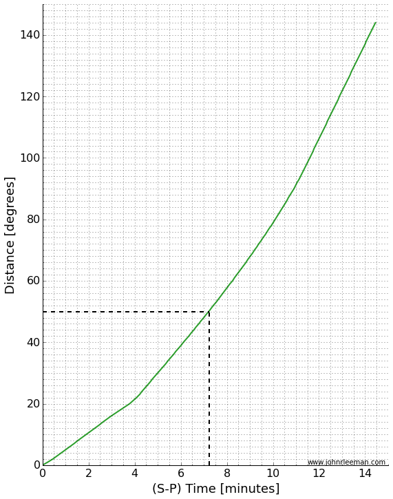
A graph of distance vs. arrival times can tell us the whole story. I've made a simple version in which you can find the time we measured (7.25 minutes) on the x-axis, then lookup the distance on the y-axis. If we do this (marked in dashed black lines), we see that the distance should be about 50 degrees.

SmP_time_curve

That's not bad! I calculated the actual distance knowing the earthquake location and station location to be 49.6 degrees. The theoretical difference in travel time based on a simple Earth model is 7.14 minutes. The slight error is due to a complex real Earth, but mostly due to me picking a rough time on an iPad screen without really zooming in on the plot. The goal was to know about how far away the earthquake was from the station though, and we did that with no problem. Just from that information it was easy to tell that the event was in the Fiji region.

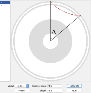
Distance is in degrees, which may seem a little strange. Since the Earth is a ball-like blob, defining distances across the surface is a little tricky when distances get large. It turns out to be more convenient to think of this distance as an angle made with the center of the earth. Take a look at the screenshot below. It's from a program called taup and shows the actual paths taken by the P and S waves through a cut-away of the Earth. I've marked the angle I'm talking about with the greek letter ∆. (We would formally say that this is the great circle arc distance in degrees. If you want to learn more about great circle arcs, you should checkout our two part podcast on map projections.)

taup_path_annotated

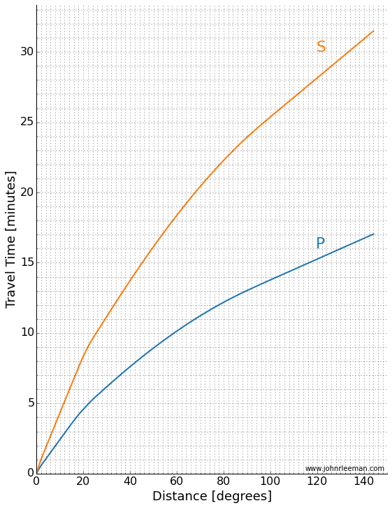
As scientists, we often look at a travel time plot a little differently. There are many different waves or "phases" that we are interested in, so plotting one line of  S-P wave arrival is rather limiting. Instead we plot a classic "travel time curve" where the arrival time after the event is plotted as a function of distance. I've reproduced one below (table of data plotted from C. Ammon).

travel_time_curve

We can make a plot like this from data too! Taking many stations, plotting them as a function of distance we get a plot like the one below. You can see curved and straight lines if you stand back and squint a little. Those are arrivals of different phases across the globe! Notice the lower curved line that matches the P-wave travel time above.

Notice the lines and curves made as different phases from the earthquake arrive across the globe. (Image: IRIS)

Notice the lines and curves made as different phases from the earthquake arrive across the globe. (Image: IRIS)

Like I mentioned, there are many different phases we can look at. To give you an idea of things a seismologist would look for, there is a version of the plot with a lot of the more complex phases marked on it below. I know it looks intimidating, but for this event, you'll see we really can't easily discern a lot of the phases. That's because this really isn't a huge event, but it's nice for us because that means the plot is easier to look at.

Arrival plot with phases marked. (Image: IRIS)

Arrival plot with phases marked. (Image: IRIS)

So there you have it, by remembering the rough travel time curves or posting one on your wall, you can quickly determine the approximate region an earthquake occurred in just by glancing at the seismograms!