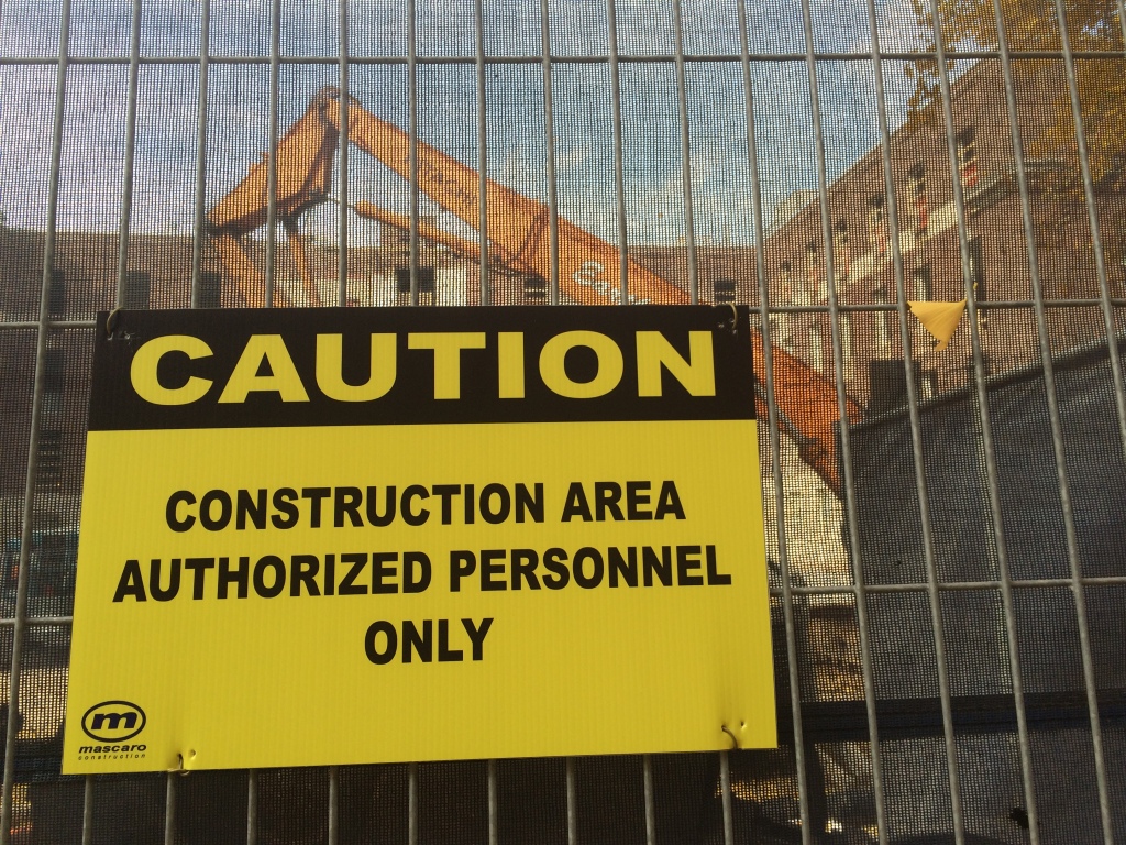
Over the last few months construction crews have been hard a work tearing into the building adjacent to mine on the Penn State campus. Lots of demolition has been happening as the old building is completely cleaned out and being rebuilt. Some of the noise has been so strong that we could feel it next-door. As a data-nut, my first thought was "I'm going to look at this on our seismometer!"
At the base of Deike building (the geoscience building), we have a seismometer. The station, WRPS "We aRe Penn State", has been in operation on an isolated pier for some time, so we have lots of data to look at! For our purposes, I downloaded the entire month of October for 2013 and 2014. There are some hours/days that are missing, but we'll ignore those and work with what we have. This is a common problem in geoscience!
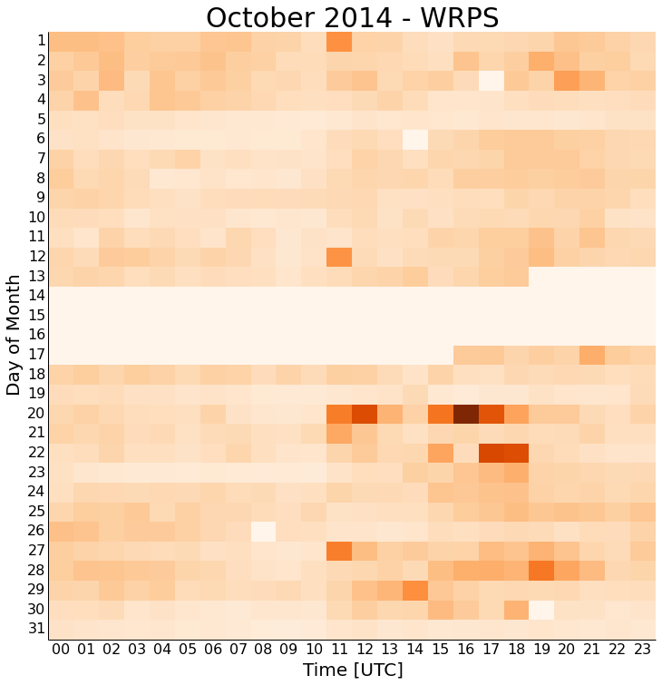
First let's just make a plot of this year's data. Each square represents one hour (24 squares in a row), and each row represents one day. Missing data is the lightest shade. The squares are colored by the strength of the seismic energy received during that hour; the darker the square, the more energy received.
 You'll immediately notice that there is always more noise starting about 11 UTC, which is the 7-8 AM hour locally. This is about when people are coming into work, vibrating the ground and buildings on campus as they do. The noise again seems to die off about 21 UTC or the 5-6 PM hour locally. This again makes sense with people leaving work and school. This isn't split finely enough to look for class change times on campus, but that could always be another project.
The other thing to point out is the dates of October 4-5,11-12,18-19,25-26. These are the weekends! You notice there is less of the normal daily noise traffic with fewer people on campus and construction halted. There is a repeating noise event at 11 UTC on the 1st, 12th, 20th, and 27th. I'm not sure what that is yet, but looking at more months of data may indicate if that event is associated with equipment starting up, or is really random.
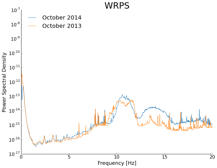
While these daily life trends are interesting, they have been observed before. This whole discussion started with construction and how it was affecting the noise we saw on our local station. To examine this, I made a stacked power spectral density plot. Basically, this shows us how much energy is recorded at different frequencies. The higher frequencies would be human activity.
We can see that the curves from 2013 and 2014 are very similar, with the exception of the 11-16 Hz range. In that range, the energy is higher in 2014 than in 2013 without construction by about a factor of 10. That range makes sense with construction activity as well! The energy remains elevated even after the main bump out to 20 Hz.
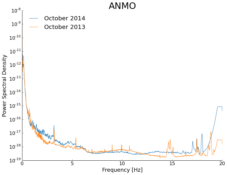
You might be thinking that such a bump could be due to anything. That's not necessarily true considering that we have stacked a month's worth of data for each curve. To show how remarkably reproducible these curves are, I made the same plot for the same times with a station in Albuquerque, New Mexico.
In the Albuquerque plot, the two years are very similar, nothing like the full order of magnitude difference we saw in University Park. There are obviously some processing effects near 20Hz, but those are not actual signal differences, just artifacts of being near the corner frequency.
That's it for now! If there is interest, we can keep digging and look at signals resulting from touchdowns in football games, class changes, factories, etc. A big thank you to Professor Chuck Ammon as well for lots of discussion about these data and processing techniques.


